

Hey, is your interior design actually working for you, or is it just filling space?
Most homes are decorated. Very few are designed. And the difference usually comes down to one quiet rule professional decorators rely on but rarely explain out loud.
It is called the 70/30 rule, and once you understand it, you will start noticing it everywhere, from boutique hotel lobbies to your friend's surprisingly put-together living room.
At ConFe Structures, an interior designer in Chennai working across homes, offices, and commercial spaces, we see this rule play out in almost every successful project. It is not a rigid law carved in stone. It is closer to a compass, something that guides decisions on color, furniture, and layout so that a space feels intentional rather than cluttered or bare. If you are exploring interior design services in Chennai, or simply trying to give your own home a refresh, this guide
will walk you through exactly what the 70/30 rule means and how to apply it practically.
Understanding the 70/30 Rule
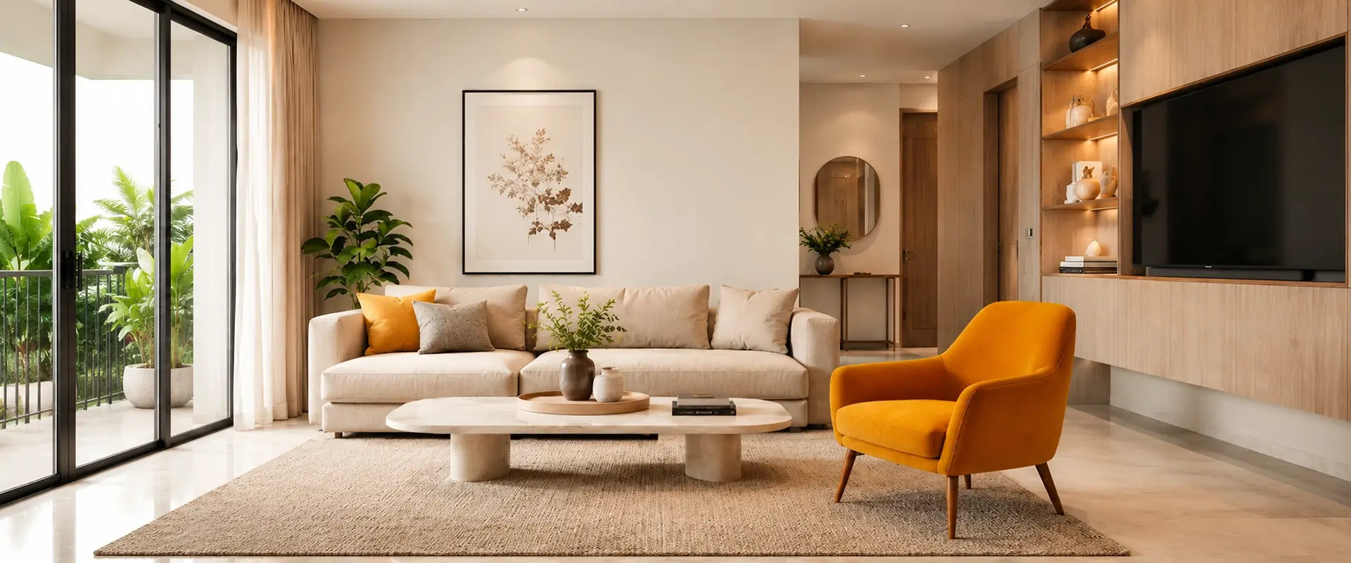
At its core, the 70/30 rule is a design principle used to create visual balance within a space. It suggests that seventy percent of a room should be dedicated to a dominant, unifying style, colour palette, or theme, while the remaining thirty per cent is left open for contrast, personality, and a bit of creative risk.
Think of it like a well-composed outfit. Seventy per cent might be a classic base, a well-fitted shirt and trousers in neutral tones, while the remaining thirty per cent is the statement piece, a bold watch, a patterned scarf, or a pair of striking shoes that pulls the whole look together. Interiors work the same way. The dominant seventy per cent gives the room structure and calm. The accent thirty per cent gives it life.
This is different from designing a room where everything matches perfectly, which often ends up feeling flat and showroom-like, and it is also different from a room where every element competes for attention, which quickly becomes overwhelming. The 70/30 rule sits comfortably between the two, offering enough consistency to feel calm and enough contrast to feel curated.
Why This Ratio Works So Well
There is a reason designers keep returning to this particular split instead of a 50/50 or 60/40 balance. The human eye naturally seeks a focal point. When a room is split evenly, there is no clear hierarchy, and the space can feel indecisive, almost like it cannot commit to an identity. When the split leans too heavily toward variety, the room feels chaotic because there is no anchor to rest on.
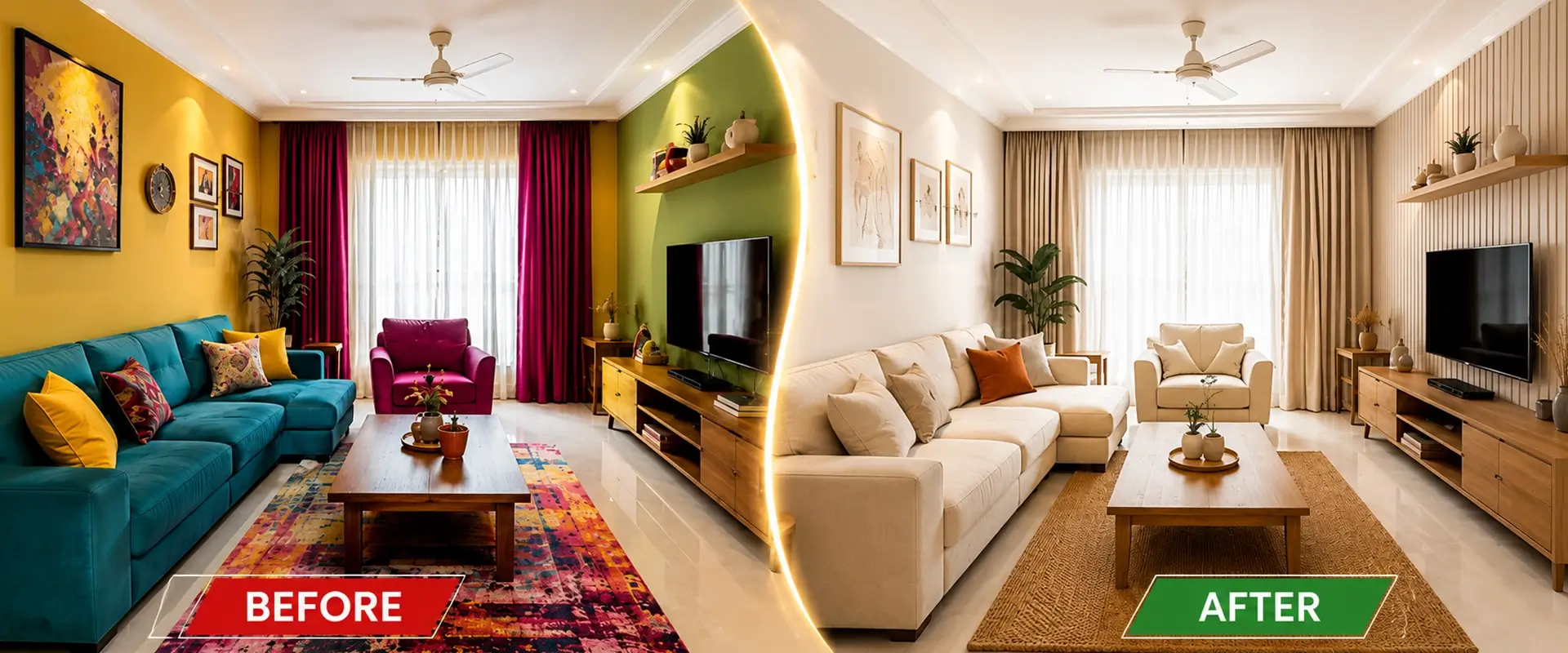
Seventy against thirty creates just enough asymmetry to feel dynamic while still allowing the eye to settle. It mirrors a principle used across visual art and photography, where asymmetrical compositions tend to feel more natural and engaging than perfectly symmetrical ones. In interior design, this translates into rooms that feel effortless, even though a lot of thought usually goes into achieving that effortlessness.
Applying the 70/30 Rule to Colour
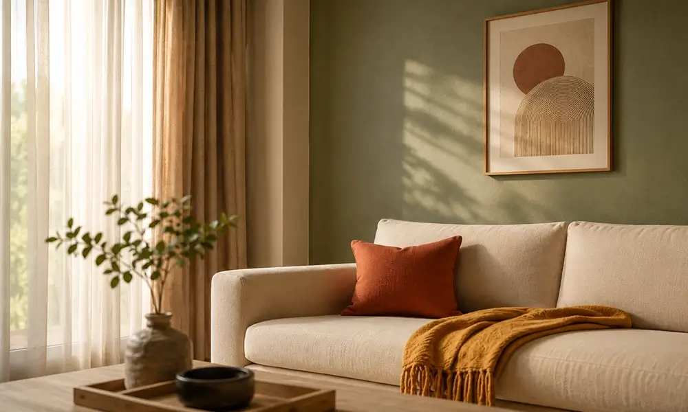
Colour is usually the easiest place to start when applying this principle. Choose a dominant colour palette, often neutral tones like beige, warm white, soft grey, or muted earth tones, and let that carry seventy per cent of the room. This includes your walls, larger furniture pieces, flooring, and any built-in elements like wardrobes or cabinetry.
The remaining thirty per cent becomes your playground. This is where you introduce a contrasting or complementary colour through cushions, throws, an accent chair, artwork, or a statement rug. If your walls are a soft sage green, your accent colour could be a deep terracotta or a warm mustard, something that feels intentional rather than random.
A mistake many homeowners make is treating every element as equally important, which results in a room with five or six competing colours and no clear direction. When you commit to a dominant palette first, choosing accents becomes far less stressful, because you already know what needs to work with what.
Applying the 70/30 Rule to Furniture and Layout
Beyond colour, this rule extends beautifully into furniture choices. Seventy per cent of your furniture should follow a consistent style, whether that is minimalist, mid-century, contemporary, or traditional Chennai-inspired teak and cane pieces. This creates a cohesive foundation that does not feel disjointed as you move through the space.
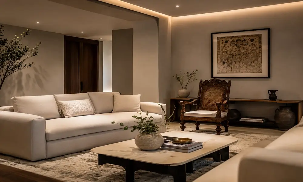
The remaining thirty per cent is where you can introduce a piece that breaks the pattern, an antique chair passed down from a grandparent, a quirky side table picked up during travel, or a modern art piece in an otherwise traditional room. This contrast is often what makes a home feel personal rather than like it was lifted directly from a catalogue.
This is also useful when working with mixed budgets. You do not need every piece of furniture to be high-end. Investing in a few statement pieces for that thirty per cent while keeping the dominant seventy per cent simple and functional is a smart, cost-effective way to create a high-impact space without overspending.
Applying the 70/30 Rule to Patterns and Textures
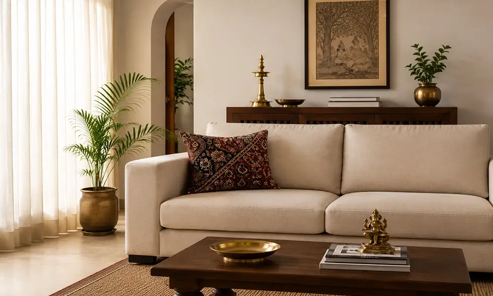
Patterns can quickly overwhelm a room if not handled carefully, and this is another area where the ratio proves useful. Let solid, calm textures dominate seventy per cent of the room through upholstery, curtains, and flooring, while introducing pattern through the remaining thirty per cent using cushions, a rug, or an accent wall.
This is particularly relevant in Chennai homes, where many people love incorporating traditional textiles, Kalamkari prints, or bold Tamil-inspired motifs into their interiors. Rather than covering an entire room in pattern, which can feel visually exhausting over time, using it as an accent allows that cultural richness to shine without overpowering the rest of the design.
How This Applies to Different Rooms
The 70/30 rule is flexible enough to apply across every room in a home, though the application shifts slightly depending on function.
In a living room, the dominant seventy per cent usually comes from your sofa, walls, and flooring, while the accent thirty per cent lives in cushions, a coffee table, and wall art. In a bedroom, the dominant palette often comes from your bedding and walls, while accents show up through a bench, curtains, or a reading nook chair. In a kitchen, cabinetry and countertops typically form the seventy per cent, while backsplash tiles, bar stools, or pendant lighting bring in the accent.
Even commercial spaces benefit from this thinking. Offices designed with a calm, professional base and a few bold accent elements- a branded colour on one wall, a striking reception desk- tend to feel more welcoming than spaces where every surface tries to make a statement.
Common Mistakes to Avoid
One frequent misstep is treating the ratio too literally, measuring exact square footage instead of using it as a general guide for visual weight. The 70/30 rule is about feel, not formula. Another common mistake is choosing an accent colour or pattern that has no relationship to the dominant palette at all, which creates jarring contrast rather than intentional balance. A good accent should feel like it belongs to the same story, even if it is the plot twist.
It is also worth avoiding the trap of applying the rule inconsistently across a single room, where colour follows the ratio but furniture style does not. For the balance to feel cohesive, it helps to think about colour, furniture, and texture together rather than in isolation.
Why Professional Guidance Makes a Difference
While the 70/30 rule sounds simple in theory, applying it well across an entire home, especially one with multiple rooms and varying functions, takes a trained eye. It involves understanding proportion, lighting, material behaviour, and how different elements will actually look together once installed, not just on a mood board.
This is where working with an experienced interior designer in Chennai becomes valuable. A professional eye can spot when a dominant palette is too safe and needs more warmth, or when an accent choice is fighting the room instead of elevating it. At ConFe Structures, our approach to interior design services in Chennai has always centred on this kind of balance: spaces that feel calm and cohesive at first glance, but reveal thoughtful personal touches the longer you spend in them.
Whether you are designing a new home from the ground up, renovating an existing space, or setting up a commercial interior, understanding a principle like the 70/30 rule gives you a strong starting point for conversations with your designer, and a clearer sense of what you actually want your space to feel like.
Bringing It All Together
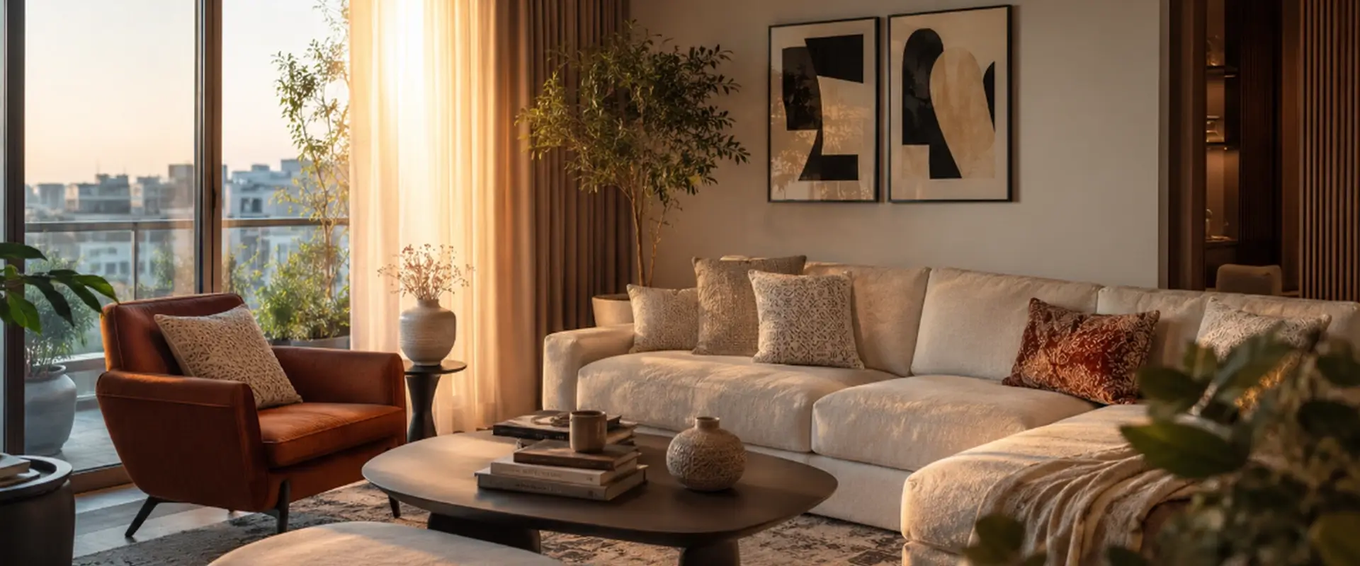
Good interior design rarely comes down to one big dramatic decision. More often, it is the result of small, considered choices: a colour that holds the room together, a piece of furniture that breaks the pattern just enough, a texture that adds warmth without taking over. The 70/30 rule gives you a simple, repeatable way to think through those choices without needing years of design training.
If you are ready to bring this kind of balance into your own home or workspace, ConFe Structures, the leading Civil Construction Company in Chennai is here to help translate the idea into a real, lived-in space you will love coming back to every day.